Toxic girl dinner
Toxic girl dinner
Toxic girl dinner
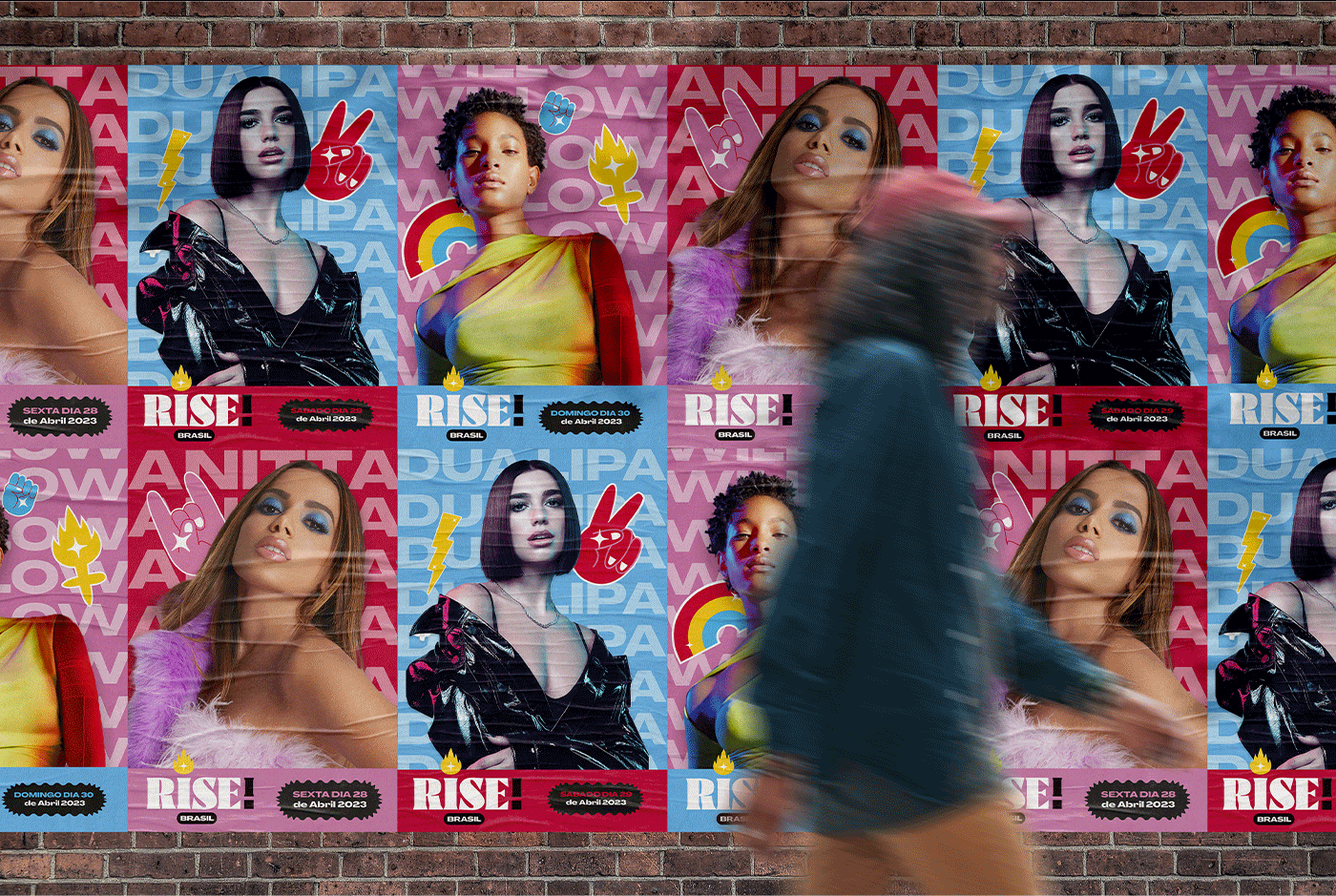
Branding, identity, and illustration for Rise, a fictional all-female music festival born from a real representation problem
Branding, identity, and illustration for Rise, a fictional all-female music festival born from a real representation problem

Year: 2023
Fictional
Role: Designer, ilustrator
Graphic design
Branding
Ilustration
Overview
Overview
Toxic Girl Dinner is a completely fictional project, created purely for fun, inspired by the 2023 "girl dinner" trend, where women (largely on TikTok) shared meals made up of foods that were, let's be honest, absolutely not dinner. That absurd, self-aware humor became the perfect entry point for a project built entirely around irony.
At its core, this is a critique of the pink tax, the practice of taking products that serve the exact same function and deciding they still need a separate, gendered version, one pink and marked up, one not. More broadly, it's a critique of the idea that products need to be labeled "just for women" or "just for men" at all, when in reality, almost everything is for everyone.
Toxic Girl Dinner takes that logic to its most ridiculous conclusion: a full line of genuinely toxic, unhealthy products, dressed up in cute, feminine packaging that would be absurd to actually sell on shelves. The "toxic" concept does double duty here, both the joke and the warning label, making it impossible to miss that none of this is meant to be taken seriously, or literally consumed.
Every product is packed with jokes, irony, and small easter eggs hidden across the packaging. Beyond the illustrations, naming, and overall concept, I also designed an original typeface for the project, the Toxic Alphabet, inspired by graffiti and urban tagging, used throughout the impact text and layout compositions to give the brand its own distinct, rebellious voice.
Toxic Girl Dinner is a completely fictional project, created purely for fun, inspired by the 2023 "girl dinner" trend, where women (largely on TikTok) shared meals made up of foods that were, let's be honest, absolutely not dinner. That absurd, self-aware humor became the perfect entry point for a project built entirely around irony.
At its core, this is a critique of the pink tax, the practice of taking products that serve the exact same function and deciding they still need a separate, gendered version, one pink and marked up, one not. More broadly, it's a critique of the idea that products need to be labeled "just for women" or "just for men" at all, when in reality, almost everything is for everyone.
Toxic Girl Dinner takes that logic to its most ridiculous conclusion: a full line of genuinely toxic, unhealthy products, dressed up in cute, feminine packaging that would be absurd to actually sell on shelves. The "toxic" concept does double duty here, both the joke and the warning label, making it impossible to miss that none of this is meant to be taken seriously, or literally consumed.
Every product is packed with jokes, irony, and small easter eggs hidden across the packaging. Beyond the illustrations, naming, and overall concept, I also designed an original typeface for the project, the Toxic Alphabet, inspired by graffiti and urban tagging, used throughout the impact text and layout compositions to give the brand its own distinct, rebellious voice.
Results


Check out more of my works