Emails redesign for Cursos Edgar Abreu
Emails redesign for Cursos Edgar Abreu
Emails redesign for Cursos Edgar Abreu
Redesigning a CRM email system without disrupting the team behind it
Redesigning a CRM email system without disrupting the team behind it
Redesigning a CRM email system without disrupting the team behind it

Year: 2025
Client: 4U Edtech
Role: UX/UI Designer
Designer supervisor: Mariana Pan Becker
UX/UI
Emails
Research
Overview
Overview
Cursos Edgar Abreu, an online education brand, had an extensive CRM email flow — but one built without a consistent visual identity or much attention to how well users actually understood the content. Emails varied wildly from one campaign to the next, with no shared design language tying them together.
Having just joined 4U Edtech, I took this project as an opportunity to both fix the emails and understand how the organization behind them actually worked. Before touching any design, I mapped out every team involved in the email process, what each one contributed, and how a redesign could improve consistency and usability without disrupting the workflows people already relied on.
The result combined a full heuristic audit of the existing emails, research-backed wireframes, and a practical solution for handing the new templates over to the CRM team, all while keeping their day-to-day process the same.
Cursos Edgar Abreu, an online education brand, had an extensive CRM email flow — but one built without a consistent visual identity or much attention to how well users actually understood the content. Emails varied wildly from one campaign to the next, with no shared design language tying them together.
Having just joined 4U Edtech, I took this project as an opportunity to both fix the emails and understand how the organization behind them actually worked. Before touching any design, I mapped out every team involved in the email process, what each one contributed, and how a redesign could improve consistency and usability without disrupting the workflows people already relied on.
The result combined a full heuristic audit of the existing emails, research-backed wireframes, and a practical solution for handing the new templates over to the CRM team, all while keeping their day-to-day process the same.
Understanding the teams and the process
Understanding the teams and the process
Before proposing any design changes, the first step was understanding who was actually behind the CRM email process, since I had only just joined the company. I needed to identify every team connected to it, what each one was responsible for, and how work moved between them, from content creation to banner design to the team that built and sent the emails themselves.
Before proposing any design changes, the first step was understanding who was actually behind the CRM email process, since I had only just joined the company. I needed to identify every team connected to it, what each one was responsible for, and how work moved between them, from content creation to banner design to the team that built and sent the emails themselves.
Once I understood the landscape and knew who to talk to, I structured a CSD Matrix (Certainties, Assumptions, Doubts) to organize everything I still needed to clarify about the process and the different types of emails sent. This became the basis for an interview with one of the CRM team members, which lasted about 1h30 and covered both the day-to-day workflow and the full range of email categories in use.
Once I understood the landscape and knew who to talk to, I structured a CSD Matrix (Certainties, Assumptions, Doubts) to organize everything I still needed to clarify about the process and the different types of emails sent. This became the basis for an interview with one of the CRM team members, which lasted about 1h30 and covered both the day-to-day workflow and the full range of email categories in use.

Process-level findings
Process-level findings
Some of the most serious problems weren't visual, they came from how the emails were actually produced. Designers were only responsible for the banner image, copywriters wrote plain, unstructured body text, and there was little communication between the two. The CRM team would then copy and paste everything directly into Active Campaign, deciding background colors and button styles on their own, with no shared guidelines to follow. The result was that no two emails looked alike.
Some of the most serious problems weren't visual, they came from how the emails were actually produced. Designers were only responsible for the banner image, copywriters wrote plain, unstructured body text, and there was little communication between the two. The CRM team would then copy and paste everything directly into Active Campaign, deciding background colors and button styles on their own, with no shared guidelines to follow. The result was that no two emails looked alike.
After the interview, I organized the answers and built a visual flow mapping out every email possibility, giving me a clear picture of the entire system before moving into any evaluation or redesign work.
After the interview, I organized the answers and built a visual flow mapping out every email possibility, giving me a clear picture of the entire system before moving into any evaluation or redesign work.

Heuristic analysis
Heuristic analysis
With the email flow mapped, the next step was evaluating the actual content. I selected one example from each email category and analyzed it against Nielsen's usability heuristics, scoring each one as Good, Needs adjustment, or Critical.
With the email flow mapped, the next step was evaluating the actual content. I selected one example from each email category and analyzed it against Nielsen's usability heuristics, scoring each one as Good, Needs adjustment, or Critical.

Design-level findings
Design-level findings
The most frequent critical issues were scannability, accessibility, visible CTAs, and contrast. Emails were dense and hard to scan, calls to action often blended into the background, and color contrast frequently failed basic accessibility standards.
The most frequent critical issues were scannability, accessibility, visible CTAs, and contrast. Emails were dense and hard to scan, calls to action often blended into the background, and color contrast frequently failed basic accessibility standards.

Close-up example of how the analysis worked
Banner-specific issues
Banner-specific issues
Banners carried an overwhelming amount of text with no visual hierarchy, making it hard to prioritize what mattered. Their horizontal format also became a major problem on mobile, where most emails are actually read, since it shrank the image down to something barely legible.
Banners carried an overwhelming amount of text with no visual hierarchy, making it hard to prioritize what mattered. Their horizontal format also became a major problem on mobile, where most emails are actually read, since it shrank the image down to something barely legible.
The trust problem
The trust problem
Text throughout the emails was long, unstructured, and tiring to read, but the most serious finding came from outside the design itself: because there was no consistent visual pattern, some customers didn't recognize the emails as legitimate. Support even reported receiving messages asking whether an email was really from the company or a scam attempt, a credibility issue serious enough to make brand consistency not just a visual improvement, but a trust and safety priority for the redesign.
Text throughout the emails was long, unstructured, and tiring to read, but the most serious finding came from outside the design itself: because there was no consistent visual pattern, some customers didn't recognize the emails as legitimate. Support even reported receiving messages asking whether an email was really from the company or a scam attempt, a credibility issue serious enough to make brand consistency not just a visual improvement, but a trust and safety priority for the redesign.
Before: Heuristic findings across the email samples
Before: Heuristic findings across the email samples
Looking across the examples below, the problems identified in the heuristic audit show up consistently, regardless of the email's category. The issue wasn't any single email, it was the absence of a shared system, leaving each one to solve layout, hierarchy, and tone differently, at the cost of both usability and brand trust.
Looking across the examples below, the problems identified in the heuristic audit show up consistently, regardless of the email's category. The issue wasn't any single email, it was the absence of a shared system, leaving each one to solve layout, hierarchy, and tone differently, at the cost of both usability and brand trust.

Visual hierarchy and scannability
Visual hierarchy and scannability
Headline, subheadline, bullet list, pricing, and CTA stacked with little breathing room
Headline, subheadline, bullet list, pricing, and CTA stacked with little breathing room
Promotional emails (CFP, CEA) combine pricing tables, urgency text, and multiple CTAs competing for attention
Promotional emails (CFP, CEA) combine pricing tables, urgency text, and multiple CTAs competing for attention
No clear entry point for the eye across most samples
No clear entry point for the eye across most samples
Inconsistent visual identity
Inconsistent visual identity
Different color scheme in nearly every email (dark blue, teal, pink, bright blue)
Different color scheme in nearly every email (dark blue, teal, pink, bright blue)
No shared layout logic or banner style between emails
No shared layout logic or banner style between emails
No visual cue tying emails back to the same sender, reinforcing the trust issue support flagged
No visual cue tying emails back to the same sender, reinforcing the trust issue support flagged
CTA visibility and contrast
CTA visibility and contrast
Some CTAs stand out clearly (e.g. the bright blue "QUERO MINHA CERTIFICAÇÃO" button) while others blend into busy backgrounds or backgrounds close in tone to the button itself
Some CTAs stand out clearly (e.g. the bright blue "QUERO MINHA CERTIFICAÇÃO" button) while others blend into busy backgrounds or backgrounds close in tone to the button itself
Some emails include two equally prominent CTAs, diluting the intended action
Some emails include two equally prominent CTAs, diluting the intended action
Banner overload
Banner overload
Dense paragraphs of text packed directly into the banner image (AI/live event, CFP mentor emails)
Dense paragraphs of text packed directly into the banner image (AI/live event, CFP mentor emails)
Multiple messages competing at once, with no prioritization
Multiple messages competing at once, with no prioritization
Especially problematic on mobile, where text becomes hard to read at a glance
Especially problematic on mobile, where text becomes hard to read at a glance
Long, unstructured body copy
Long, unstructured body copy
Long-running paragraphs instead of scannable blocks
Long-running paragraphs instead of scannable blocks
Checklists and bullet points formatted inconsistently across emails
Checklists and bullet points formatted inconsistently across emails
Key details (deadlines, prices, requirements) buried in running text instead of visually separated
Key details (deadlines, prices, requirements) buried in running text instead of visually separated
The after: structure the team can actually use
The after: structure the team can actually use
With the audit findings in hand, the next step was looking outward. I researched competitor emails and similar market examples to understand how larger companies structure their communications, alongside a broader study of email marketing best practices, what keeps emails out of spam folders, and what actually captures attention in the seconds after someone opens an email.
With the audit findings in hand, the next step was looking outward. I researched competitor emails and similar market examples to understand how larger companies structure their communications, alongside a broader study of email marketing best practices, what keeps emails out of spam folders, and what actually captures attention in the seconds after someone opens an email.

Based on that research and the improvements identified in the audit, I moved into wireframing each email type, defining copy structure, banner composition, and overall layout for every category.
Based on that research and the improvements identified in the audit, I moved into wireframing each email type, defining copy structure, banner composition, and overall layout for every category.
The wireframes were then developed into high-fidelity versions and submitted for approval from the senior designer, the CRM team, and the marketing manager. Once approved, I brought together everyone involved to present the new email format and the best practices behind it, making sure every team understood not just what changed, but why, so the new standard could be followed consistently going forward.
The wireframes were then developed into high-fidelity versions and submitted for approval from the senior designer, the CRM team, and the marketing manager. Once approved, I brought together everyone involved to present the new email format and the best practices behind it, making sure every team understood not just what changed, but why, so the new standard could be followed consistently going forward.
The final step was translating these approved designs into templates directly in Active Campaign. This let the CRM team keep using the platform they already knew, adapting text and images for each email, without being able to accidentally break the layout or visual structure that had just been standardized.
The final step was translating these approved designs into templates directly in Active Campaign. This let the CRM team keep using the platform they already knew, adapting text and images for each email, without being able to accidentally break the layout or visual structure that had just been standardized.

Overdue payments email
Overdue payments email
Before: the email opened with a long, warm introduction before ever mentioning why the customer was receiving it, burying the actual reason (an overdue payment) several paragraphs deep. There was no consistent header identity, no footer pattern, and the single CTA had to compete with a wall of text around it for attention.
After: the message now leads with the reason for the email upfront, so the customer understands the situation within the first few seconds of opening it. The key offer (no-interest payment until the end of the week) is pulled out into its own highlighted block instead of being buried in a paragraph, making it the most scannable part of the message. Text was cut down significantly, keeping only what changes the customer's decision: the problem, the solution, and how to get help if needed.
This version also establishes the structural pattern applied across every email in the redesign: a consistent header with the logo (for immediate brand recognition and trust), a footer with social links, a support contact button, and an unsubscribe option, plus a clear, high-contrast CTA button.
Before: the email opened with a long, warm introduction before ever mentioning why the customer was receiving it, burying the actual reason (an overdue payment) several paragraphs deep. There was no consistent header identity, no footer pattern, and the single CTA had to compete with a wall of text around it for attention.
After: the message now leads with the reason for the email upfront, so the customer understands the situation within the first few seconds of opening it. The key offer (no-interest payment until the end of the week) is pulled out into its own highlighted block instead of being buried in a paragraph, making it the most scannable part of the message. Text was cut down significantly, keeping only what changes the customer's decision: the problem, the solution, and how to get help if needed.
This version also establishes the structural pattern applied across every email in the redesign: a consistent header with the logo (for immediate brand recognition and trust), a footer with social links, a support contact button, and an unsubscribe option, plus a clear, high-contrast CTA button.

Live event announcement email
Live event announcement email
Before: the email combined two separate live-event banners (one at the top, another duplicated further down), competing color schemes (cyan, teal, dark navy), and multiple typefaces used inconsistently for emphasis. There was no clear starting point, and the checklist items used plain green checkmarks with no visual weight, making the value proposition easy to skim past.
After: the redesign leans into the "live now" energy while giving it structure. A single, cohesive banner at the top establishes the event context, the "Ganhe um PDF exclusivo" badge, and the offer in a clear visual hierarchy, followed by consistent typography for the headline. Below the banner, the body reintroduces the same content, now organized with icon-based cards for each benefit (money, clock, sparkles), which are far easier to scan than plain checkmarks in a paragraph-style list.
The email also removes the duplicated second banner entirely, since it repeated the same message the header already communicated, reducing redundancy and shortening the email overall. The CTA is now a single, high-contrast button consistent with the rest of the redesign, instead of two competing calls to action.
This email also reflects the same structural pattern applied across the redesign: consistent header with the logo, footer with support contact, social links, and unsubscribe option.
Before: the email combined two separate live-event banners (one at the top, another duplicated further down), competing color schemes (cyan, teal, dark navy), and multiple typefaces used inconsistently for emphasis. There was no clear starting point, and the checklist items used plain green checkmarks with no visual weight, making the value proposition easy to skim past.
After: the redesign leans into the "live now" energy while giving it structure. A single, cohesive banner at the top establishes the event context, the "Ganhe um PDF exclusivo" badge, and the offer in a clear visual hierarchy, followed by consistent typography for the headline. Below the banner, the body reintroduces the same content, now organized with icon-based cards for each benefit (money, clock, sparkles), which are far easier to scan than plain checkmarks in a paragraph-style list.
The email also removes the duplicated second banner entirely, since it repeated the same message the header already communicated, reducing redundancy and shortening the email overall. The CTA is now a single, high-contrast button consistent with the rest of the redesign, instead of two competing calls to action.
This email also reflects the same structural pattern applied across the redesign: consistent header with the logo, footer with support contact, social links, and unsubscribe option.
*The banner shown here is a placeholder built to illustrate hierarchy, proportions, and content structure, it's a reference for the design team to build the final version from, not the finished asset.
*The banner shown here is a placeholder built to illustrate hierarchy, proportions, and content structure, it's a reference for the design team to build the final version from, not the finished asset.
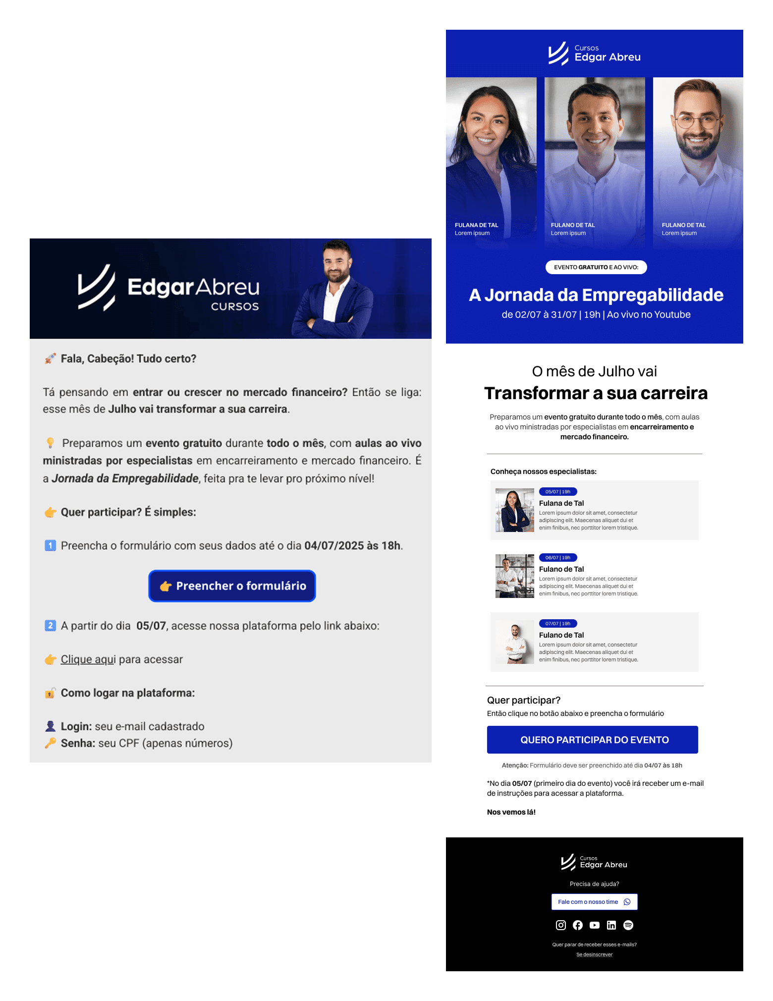
"Jornada da Empregabilidade" event invitation email
"Jornada da Empregabilidade" event invitation email
Before: the email had no dedicated banner for the event itself, only the standard header with Edgar's photo, giving the invitation no visual distinction from any other email in the flow. The three guest speakers were never shown, mentioned only vaguely as "specialists," and the reader had to get through several paragraphs of introduction before reaching any concrete information about dates or how to participate.
After: the new banner puts the event's biggest asset front and center, the three guest speakers, showing who they are, alongside the event name, format (free, live), and dates directly below their photos. This turns an abstract "expert-led classes" promise into something concrete and credible before the reader even scrolls.
The body was restructured to lead with the value proposition, followed by a dedicated section introducing each speaker individually (photo, date, short bio), so the reader understands exactly what each live session covers and when. Text throughout was tightened considerably, removing repeated explanations and consolidating instructions into a single, clear participation flow, deadline, CTA, and what happens next, without the extra steps and repeated icons from the original.
Before: the email had no dedicated banner for the event itself, only the standard header with Edgar's photo, giving the invitation no visual distinction from any other email in the flow. The three guest speakers were never shown, mentioned only vaguely as "specialists," and the reader had to get through several paragraphs of introduction before reaching any concrete information about dates or how to participate.
After: the new banner puts the event's biggest asset front and center, the three guest speakers, showing who they are, alongside the event name, format (free, live), and dates directly below their photos. This turns an abstract "expert-led classes" promise into something concrete and credible before the reader even scrolls.
The body was restructured to lead with the value proposition, followed by a dedicated section introducing each speaker individually (photo, date, short bio), so the reader understands exactly what each live session covers and when. Text throughout was tightened considerably, removing repeated explanations and consolidating instructions into a single, clear participation flow, deadline, CTA, and what happens next, without the extra steps and repeated icons from the original.
*The banner shown here is a placeholder built to illustrate hierarchy, proportions, and content structure, it's a reference for the design team to build the final version from, not the finished asset.
*The banner shown here is a placeholder built to illustrate hierarchy, proportions, and content structure, it's a reference for the design team to build the final version from, not the finished asset.

"Sou Bancário" podcast launch email
"Sou Bancário" podcast launch email
Before: the email opened with a long, conversational introduction before getting to any concrete information, and the key details (launch date, guest, topic) were scattered across running paragraphs instead of being visually separated. The guest, Marcelo Billi, was mentioned only in passing within a dense paragraph, giving him no visual weight despite being a strong credibility signal for the announcement. Practical reminders (day, time, channel) were also buried in plain text with emoji bullets, easy to skim past.
After: the redesign turns the same content into something far easier to scan and remember. The banner now leads with the podcast's own visual identity and premiere schedule, giving the announcement more presence before the reader even gets to the body text. The value proposition was broken into three icon-based cards ("talks with real market voices," "exam tips," "regulatory updates"), replacing a single dense paragraph with something a reader can absorb in seconds.
The first guest, Marcelo Billi, now has his own dedicated card with photo, title, and topic, giving him the spotlight instead of being one more name inside a paragraph. Key reminders (day and time, YouTube channel, notification bell) were consolidated into a single highlighted "Lembre-se" block, making the most important logistical details the easiest part of the email to find and remember later.
Before: the email opened with a long, conversational introduction before getting to any concrete information, and the key details (launch date, guest, topic) were scattered across running paragraphs instead of being visually separated. The guest, Marcelo Billi, was mentioned only in passing within a dense paragraph, giving him no visual weight despite being a strong credibility signal for the announcement. Practical reminders (day, time, channel) were also buried in plain text with emoji bullets, easy to skim past.
After: the redesign turns the same content into something far easier to scan and remember. The banner now leads with the podcast's own visual identity and premiere schedule, giving the announcement more presence before the reader even gets to the body text. The value proposition was broken into three icon-based cards ("talks with real market voices," "exam tips," "regulatory updates"), replacing a single dense paragraph with something a reader can absorb in seconds.
The first guest, Marcelo Billi, now has his own dedicated card with photo, title, and topic, giving him the spotlight instead of being one more name inside a paragraph. Key reminders (day and time, YouTube channel, notification bell) were consolidated into a single highlighted "Lembre-se" block, making the most important logistical details the easiest part of the email to find and remember later.
*The banner shown here is a placeholder built to illustrate hierarchy, proportions, and content structure, it's a reference for the design team to build the final version from, not the finished asset.
*The banner shown here is a placeholder built to illustrate hierarchy, proportions, and content structure, it's a reference for the design team to build the final version from, not the finished asset.

CFP promotional email
CFP promotional email
Before: the banner packed the headline, price, event details, and Edgar's photo into a single busy visual with several competing colors (orange, red, dark navy), making it hard to know what to focus on first. The offer (R$100 per module) and the condition attached to it (only for live attendees) were mentioned separately in different parts of the text, so a reader skimming quickly could easily miss the actual catch. The three benefits were formatted as a plain bullet list with pin emojis, giving them the same visual weight as any other line of text.
After: the banner now isolates the single most urgent message, "Última Chance," as its own clear headline, followed by the price offer directly beneath it, in a much more focused visual hierarchy. The body reorganizes the same content into a clear cause-and-effect structure: the offer, the condition attached to it (highlighted in its own box, "é só para quem estiver assistindo nossa live ao vivo"), and the three benefits displayed as icon-based cards instead of a plain bullet list. This makes the trade-off, "why R$100" and "what you have to do to get it", impossible to miss, which was easy to lose in the original's continuous paragraphs.
A reminder line right above the CTA reinforces the live-only condition one more time before the reader commits, and the CTA itself now stands alone as the clear next step, instead of being one of several bold elements competing for attention.
Before: the banner packed the headline, price, event details, and Edgar's photo into a single busy visual with several competing colors (orange, red, dark navy), making it hard to know what to focus on first. The offer (R$100 per module) and the condition attached to it (only for live attendees) were mentioned separately in different parts of the text, so a reader skimming quickly could easily miss the actual catch. The three benefits were formatted as a plain bullet list with pin emojis, giving them the same visual weight as any other line of text.
After: the banner now isolates the single most urgent message, "Última Chance," as its own clear headline, followed by the price offer directly beneath it, in a much more focused visual hierarchy. The body reorganizes the same content into a clear cause-and-effect structure: the offer, the condition attached to it (highlighted in its own box, "é só para quem estiver assistindo nossa live ao vivo"), and the three benefits displayed as icon-based cards instead of a plain bullet list. This makes the trade-off, "why R$100" and "what you have to do to get it", impossible to miss, which was easy to lose in the original's continuous paragraphs.
A reminder line right above the CTA reinforces the live-only condition one more time before the reader commits, and the CTA itself now stands alone as the clear next step, instead of being one of several bold elements competing for attention.
*The banner shown here is a placeholder built to illustrate hierarchy, proportions, and content structure, it's a reference for the design team to build the final version from, not the finished asset.
*The banner shown here is a placeholder built to illustrate hierarchy, proportions, and content structure, it's a reference for the design team to build the final version from, not the finished asset.

CPA-20 promotional email
CPA-20 promotional email
Before: the banner combined three certification badges (CPA-10, CPA-20, CEA), photos of three different mentors, an ANBIMA seal, and two overlapping headlines, giving the reader several competing focal points before understanding this email was specifically about CPA-20. The pricing table used a bright blue border and the checklist benefits were formatted with emoji checkmarks inline with the text, giving them less visual separation from the rest of the copy.
After: the banner now isolates a single certification (CPA-20) with its own badge, removing the other certifications and mentor photos that weren't relevant to this specific offer, and lets "40% OFF" stand on its own as the dominant visual element. The body repeats this same focus: certification name, headline, and discount presented in a clear top-down hierarchy, followed by the benefit checklist inside its own light gray container instead of floating loosely in the page.
The pricing cards were redesigned with a consistent dark navy background matching the rest of the email's color palette, replacing the previous mismatched blue outline, and the plan names now sit in their own small pill labels for quicker scanning between the two options. The CTA also moved to directly follow the pricing cards, shortening the distance between "here's the price" and "here's the button to act," instead of being separated by an extra divider and additional text as in the original.
Before: the banner combined three certification badges (CPA-10, CPA-20, CEA), photos of three different mentors, an ANBIMA seal, and two overlapping headlines, giving the reader several competing focal points before understanding this email was specifically about CPA-20. The pricing table used a bright blue border and the checklist benefits were formatted with emoji checkmarks inline with the text, giving them less visual separation from the rest of the copy.
After: the banner now isolates a single certification (CPA-20) with its own badge, removing the other certifications and mentor photos that weren't relevant to this specific offer, and lets "40% OFF" stand on its own as the dominant visual element. The body repeats this same focus: certification name, headline, and discount presented in a clear top-down hierarchy, followed by the benefit checklist inside its own light gray container instead of floating loosely in the page.
The pricing cards were redesigned with a consistent dark navy background matching the rest of the email's color palette, replacing the previous mismatched blue outline, and the plan names now sit in their own small pill labels for quicker scanning between the two options. The CTA also moved to directly follow the pricing cards, shortening the distance between "here's the price" and "here's the button to act," instead of being separated by an extra divider and additional text as in the original.
*The banner shown here is a placeholder built to illustrate hierarchy, proportions, and content structure, it's a reference for the design team to build the final version from, not the finished asset.
*The banner shown here is a placeholder built to illustrate hierarchy, proportions, and content structure, it's a reference for the design team to build the final version from, not the finished asset.

Valentine's Week ("Semana dos Namorados") promotional email
Valentine's Week ("Semana dos Namorados") promotional email
Before: the banner packed several small themed elements, love-struck emoji stickers, a "Semana dos Namorados" logo, Edgar's photo, and a "50% OFF" badge, into a single cramped grid with no clear focal point, making it feel more like a collage than a deliberate hierarchy. The urgency message ("last day for the discount") appeared only as a short line of body text easy to miss, and the CTA button style (pink outline, emoji on both sides) didn't match the visual weight the offer deserved. The email also repeated the same CTA text twice, near the top and again at the bottom, without adding new information between them.
After: the banner now organizes the same seasonal, playful elements (theme label, photo, mood icons, discount) into clearly defined tiles, keeping the Valentine's tone without the visual clutter. "50% OFF" gets its own dedicated card, making it the most prominent element on the banner instead of competing with several other pieces. Below the banner, the body leads with "Última chance" and "Curso completo CEA" stacked in a clear top-down hierarchy, followed immediately by the discount in large type, so the offer and its urgency are understood before the reader reads a single sentence of body copy.
The supporting text was significantly shortened, cutting repeated persuasive arguments and consolidating the message into a single clear reason to act now. The CTA appears only once, paired with a short reinforcement line ("A promoção acaba hoje!") right below it instead of a second, redundant button further down the email.
Before: the banner packed several small themed elements, love-struck emoji stickers, a "Semana dos Namorados" logo, Edgar's photo, and a "50% OFF" badge, into a single cramped grid with no clear focal point, making it feel more like a collage than a deliberate hierarchy. The urgency message ("last day for the discount") appeared only as a short line of body text easy to miss, and the CTA button style (pink outline, emoji on both sides) didn't match the visual weight the offer deserved. The email also repeated the same CTA text twice, near the top and again at the bottom, without adding new information between them.
After: the banner now organizes the same seasonal, playful elements (theme label, photo, mood icons, discount) into clearly defined tiles, keeping the Valentine's tone without the visual clutter. "50% OFF" gets its own dedicated card, making it the most prominent element on the banner instead of competing with several other pieces. Below the banner, the body leads with "Última chance" and "Curso completo CEA" stacked in a clear top-down hierarchy, followed immediately by the discount in large type, so the offer and its urgency are understood before the reader reads a single sentence of body copy.
The supporting text was significantly shortened, cutting repeated persuasive arguments and consolidating the message into a single clear reason to act now. The CTA appears only once, paired with a short reinforcement line ("A promoção acaba hoje!") right below it instead of a second, redundant button further down the email.
*The banner shown here is a placeholder built to illustrate hierarchy, proportions, and content structure, it's a reference for the design team to build the final version from, not the finished asset.
*The banner shown here is a placeholder built to illustrate hierarchy, proportions, and content structure, it's a reference for the design team to build the final version from, not the finished asset.
What I learned
What I learned
UX is more than screens.
UX is more than screens.
This project reinforced that design work often starts before any interface is touched, rethinking flows, organizing scattered information, and finding better solutions even for processes that had been done the same way for a long time. Just because something has always been done a certain way doesn't mean it's the right way.
This project reinforced that design work often starts before any interface is touched, rethinking flows, organizing scattered information, and finding better solutions even for processes that had been done the same way for a long time. Just because something has always been done a certain way doesn't mean it's the right way.
Cross-team communication isn't optional, it's part of the job.
Cross-team communication isn't optional, it's part of the job.
Every change proposed here affected the work of designers, copywriters, and the CRM team downstream. Prioritizing that communication upfront, rather than treating it as a side conversation, was as important to the project's success as any design decision.
Every change proposed here affected the work of designers, copywriters, and the CRM team downstream. Prioritizing that communication upfront, rather than treating it as a side conversation, was as important to the project's success as any design decision.
Design happens inside real organizational context.
Design happens inside real organizational context.
Joining mid-project meant mapping people and processes before proposing any visual change. A redesign only works if it fits into how people actually work, not an idealized version of the workflow.
Joining mid-project meant mapping people and processes before proposing any visual change. A redesign only works if it fits into how people actually work, not an idealized version of the workflow.
Visual consistency is a matter of trust, not just aesthetics.
Visual consistency is a matter of trust, not just aesthetics.
Support reporting that customers questioned whether emails were legitimate was a clear reminder that inconsistent design carries real business risk. A unified visual identity isn't just about looking more professional, it protects the relationship between a brand and the people who trust it.
Support reporting that customers questioned whether emails were legitimate was a clear reminder that inconsistent design carries real business risk. A unified visual identity isn't just about looking more professional, it protects the relationship between a brand and the people who trust it.
A good design solution has to survive without you.
A good design solution has to survive without you.
Delivering high-fidelity screens wasn't enough on its own, the real solution was building templates in Active Campaign that let the CRM team keep working independently. Design that depends on the designer's constant involvement isn't a sustainable solution.
Delivering high-fidelity screens wasn't enough on its own, the real solution was building templates in Active Campaign that let the CRM team keep working independently. Design that depends on the designer's constant involvement isn't a sustainable solution.
Check out more of my works