Plot — A social network for real-life moments
Plot — A social network for real-life moments
Plot — A social network for real-life moments
See what your friends are up to, plan your own gatherings, and never miss the moments that matter. Plot is where the experience actually lives.
See what your friends are up to, plan your own gatherings, and never miss the moments that matter. Plot is where the experience actually lives.
See what your friends are up to, plan your own gatherings, and never miss the moments that matter. Plot is where the experience actually lives.

Year: 2026
Client: Personal project
Product design
UX/UI
Research
Overview
Overview
The idea for Plot started with an observation: several event apps have tried to build a social layer around events, but none of them have really succeeded at it. That gap became the starting point for a question: was there an actual, unmet need for a digital space where people could see where their friends are going in real life, and create their own events more easily?
To validate that question, I looked at two of the most used event apps in the Brazilian market: Sympla and Shotgun.
Sympla leans toward cultural events (concerts, theater, workshops) while Shotgun is more focused on nightlife and party venues. Both include a social feature of some kind, but it's limited to the events sold on their own platforms, therefore, the social layer only exists inside their transaction funnel.
The idea for Plot started with an observation: several event apps have tried to build a social layer around events, but none of them have really succeeded at it. That gap became the starting point for a question: was there an actual, unmet need for a digital space where people could see where their friends are going in real life, and create their own events more easily?
To validate that question, I looked at two of the most used event apps in the Brazilian market: Sympla and Shotgun.
Sympla leans toward cultural events (concerts, theater, workshops) while Shotgun is more focused on nightlife and party venues. Both include a social feature of some kind, but it's limited to the events sold on their own platforms, therefore, the social layer only exists inside their transaction funnel.
That's the gap Plot is designed to fill: a space built around all events, regardless of where the ticket is sold, with the focus shifted from the transaction to the social experience — who's going, how to organize it, and how people actually show up together.
That's the gap Plot is designed to fill: a space built around all events, regardless of where the ticket is sold, with the focus shifted from the transaction to the social experience — who's going, how to organize it, and how people actually show up together.
Desk Research
Desk Research
To validate the assumption behind Plot, I looked into recent data on how young adults are relating to social media and in-person connection.
To validate the assumption behind Plot, I looked into recent data on how young adults are relating to social media and in-person connection.
According to the American Time Use Survey, people aged 15 to 24 now spend 70% less time with friends in person than their counterparts did in 2003
According to the American Time Use Survey, people aged 15 to 24 now spend 70% less time with friends in person than their counterparts did in 2003
A 2025 global survey found that 80% of Gen Z respondents had felt lonely in the past year, compared to 45% of Baby Boomers.
A 2025 global survey found that 80% of Gen Z respondents had felt lonely in the past year, compared to 45% of Baby Boomers.
At the same time, the desire to step away from the feed is measurable and growing.
At the same time, the desire to step away from the feed is measurable and growing.
81% of Gen Z adults and 78% of millennial adults often wish they could disconnect from digital devices more easily according to a 2025 survey conducted in February.
81% of Gen Z adults and 78% of millennial adults often wish they could disconnect from digital devices more easily according to a 2025 survey conducted in February.
This shift is already reshaping how young people spend their free time — a growing share of Gen Z and millennials are deleting social apps and deliberately seeking in-person, analog ways to connect, from record stores to hobby groups to simply seeing friends face-to-face.
This shift is already reshaping how young people spend their free time — a growing share of Gen Z and millennials are deleting social apps and deliberately seeking in-person, analog ways to connect, from record stores to hobby groups to simply seeing friends face-to-face.
What does this means for Plot?
What does this means for Plot?
The research confirms two things: young adults are actively looking for reasons to spend less time on their phones and more time with the people around them, but the tools they currently have (social media, ticketing apps) aren't built for that shift.
They're built to keep attention inside the feed, not to organize what happens outside of it. That's the space Plot is designed to occupy: not another feed to scroll, but a lightweight layer that helps people turn "I want to see my friends more" into an actual plan.
The research confirms two things: young adults are actively looking for reasons to spend less time on their phones and more time with the people around them, but the tools they currently have (social media, ticketing apps) aren't built for that shift.
They're built to keep attention inside the feed, not to organize what happens outside of it. That's the space Plot is designed to occupy: not another feed to scroll, but a lightweight layer that helps people turn "I want to see my friends more" into an actual plan.
User Interviews
User Interviews
To ground the desk research in real behavior, I interviewed 5 people between the ages of 21 and 31 about how they currently plan their social lives, discover events, and stay in touch with different friend groups.
A few patterns came up repeatedly across the conversations:
To ground the desk research in real behavior, I interviewed 5 people between the ages of 21 and 31 about how they currently plan their social lives, discover events, and stay in touch with different friend groups.
A few patterns came up repeatedly across the conversations:
People juggle multiple, disconnected friend groups with no single view of what any of them are planning;
People juggle multiple, disconnected friend groups with no single view of what any of them are planning;
Decision fatigue and FOMO are common when weekend plans aren't clear in advance;
Decision fatigue and FOMO are common when weekend plans aren't clear in advance;
Hosting or organizing events often comes with real friction, from remembering who to invite to keeping track of dates.
Hosting or organizing events often comes with real friction, from remembering who to invite to keeping track of dates.
Based on these interviews, I distilled the findings into two personas that represent distinct but complementary needs: someone who struggles to discover what's happening and decide where to go, and someone who struggles to organize and host events for the people around them.
Based on these interviews, I distilled the findings into two personas that represent distinct but complementary needs: someone who struggles to discover what's happening and decide where to go, and someone who struggles to organize and host events for the people around them.


Feature Prioritization
Feature Prioritization
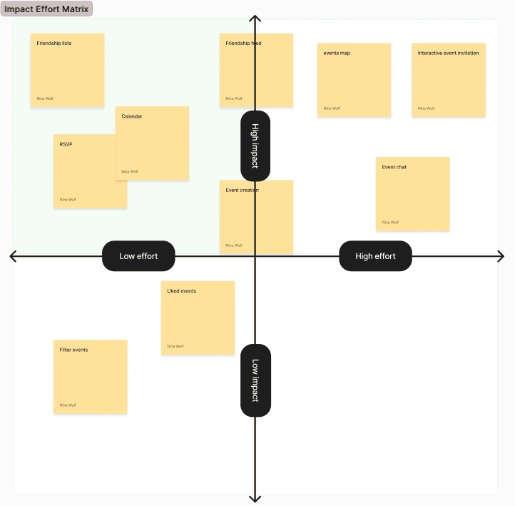
Based on the needs identified through Bia and Rafael's personas I mapped out the app's core features on an impact vs. effort matrix to decide what belonged in the first version of Plot.
Features like the friends list, friendship feed, calendar, and RSVP landed in the high-impact, low-effort quadrant as these directly solve the personas' main pain points and became the foundation of the MVP.
Event creation and the events map came in as high-impact but higher-effort features, justified by how central they are to the core experience, even if they require more development work. Lower-priority features, like event chat, filtering, and liked events, were placed for a later phase — useful additions, but not essential to prove the core value of the product first.
Based on the needs identified through Bia and Rafael's personas I mapped out the app's core features on an impact vs. effort matrix to decide what belonged in the first version of Plot.
Features like the friends list, friendship feed, calendar, and RSVP landed in the high-impact, low-effort quadrant as these directly solve the personas' main pain points and became the foundation of the MVP.
Event creation and the events map came in as high-impact but higher-effort features, justified by how central they are to the core experience, even if they require more development work. Lower-priority features, like event chat, filtering, and liked events, were placed for a later phase — useful additions, but not essential to prove the core value of the product first.
Wireframes
Wireframes
With the priority matrix guiding what to build first, the next step was translating those features into low-fidelity wireframes in Figma: mapping out the core screens and user flows before any visual design decisions came into play.
The goal at this stage was structure, defining how the friends' feed, calendar, event creation, and RSVP flows would fit together into a coherent navigation, and making sure the app's main promise (seeing what your friends are doing and organizing your own events) stayed front and center on the first screens a user opens.
With the priority matrix guiding what to build first, the next step was translating those features into low-fidelity wireframes in Figma: mapping out the core screens and user flows before any visual design decisions came into play.
The goal at this stage was structure, defining how the friends' feed, calendar, event creation, and RSVP flows would fit together into a coherent navigation, and making sure the app's main promise (seeing what your friends are doing and organizing your own events) stayed front and center on the first screens a user opens.
Event creation path
Event creation path
From the home screen, users can start creating an event at any time through the persistent + button in the bottom navigation — always accessible, no matter where they are in the app.
Tapping it opens Basics, where the essential structure of any event is defined: public or private, event type, name, date, time, and location. From there, users move into Personalize, where the event gets its identity — a cover image (uploaded or AI-generated), an optional theme, dress code, tags, and a description guests will actually read.
Before publishing, Overview shows a full summary of everything defined so far, with inline editing available for any section. Once created, the event opens its own dedicated page — where the host can add guests and keep adjusting any detail whenever needed, without ever having to delete the event or go through the creation flow again.
From the home screen, users can start creating an event at any time through the persistent + button in the bottom navigation — always accessible, no matter where they are in the app.
Tapping it opens Basics, where the essential structure of any event is defined: public or private, event type, name, date, time, and location. From there, users move into Personalize, where the event gets its identity — a cover image (uploaded or AI-generated), an optional theme, dress code, tags, and a description guests will actually read.
Before publishing, Overview shows a full summary of everything defined so far, with inline editing available for any section. Once created, the event opens its own dedicated page — where the host can add guests and keep adjusting any detail whenever needed, without ever having to delete the event or go through the creation flow again.

Calendar flow
Calendar flow
From the home screen, the events with the nearest confirmed dates surface as a quick reminder near the top of the page — a shortcut that takes users straight to that event's page without needing to search for it.
For a broader view, the calendar icon in the bottom navigation is always accessible, taking users to their full calendar at any point in the app. From there, events are organized by date, with a week view below highlighting what's coming up next. Tapping into any listed event opens its dedicated page — the same destination reached from the home screen reminder, just through a different entry point.
From the home screen, the events with the nearest confirmed dates surface as a quick reminder near the top of the page — a shortcut that takes users straight to that event's page without needing to search for it.
For a broader view, the calendar icon in the bottom navigation is always accessible, taking users to their full calendar at any point in the app. From there, events are organized by date, with a week view below highlighting what's coming up next. Tapping into any listed event opens its dedicated page — the same destination reached from the home screen reminder, just through a different entry point.

Invitation flow
Invitation flow
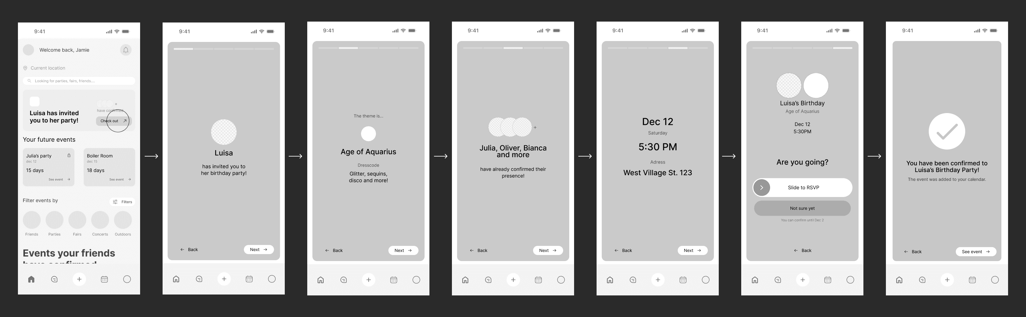
When a friend is invited to an event, the invitation itself opens as an interactive, story-style sequence — a familiar, on-trend format that turns a simple RSVP into something that feels more personal and engaging than a static notification.
Tapping the invite from the home screen launches this sequence: who's hosting, the event's theme, who else has already confirmed, then the essential details — date, time, and location — each revealed one screen at a time, the same way stories unfold.
The flow closes on the RSVP decision itself, using a slide-to-confirm gesture rather than a regular tap. That extra bit of friction is intentional — it prevents accidental confirmations and makes sure the guest only commits when they actually mean to. A lighter "not sure yet" option stays available for anyone who isn't ready to decide. Once confirmed, the event is automatically added to the guest's calendar, closing the loop without any extra steps.
When a friend is invited to an event, the invitation itself opens as an interactive, story-style sequence — a familiar, on-trend format that turns a simple RSVP into something that feels more personal and engaging than a static notification.
Tapping the invite from the home screen launches this sequence: who's hosting, the event's theme, who else has already confirmed, then the essential details — date, time, and location — each revealed one screen at a time, the same way stories unfold.
The flow closes on the RSVP decision itself, using a slide-to-confirm gesture rather than a regular tap. That extra bit of friction is intentional — it prevents accidental confirmations and makes sure the guest only commits when they actually mean to. A lighter "not sure yet" option stays available for anyone who isn't ready to decide. Once confirmed, the event is automatically added to the guest's calendar, closing the loop without any extra steps.
Design system
Design system
Before detailing the design system itself, it's worth noting that Plot's visual identity follows a fun, youthful language. The vibrant purple stands out the most, both in the brand identity and across the app's visual system.
Before detailing the design system itself, it's worth noting that Plot's visual identity follows a fun, youthful language. The vibrant purple stands out the most, both in the brand identity and across the app's visual system.

Typography
Typography
Inter was chosen for being a widely used, highly legible, free typeface supported across all platforms. It also plays a deliberate role in the identity, since staying neutral avoids competing with the app's playful visuals, prioritizing readability and accessibility above visual flair in this specific case.
Inter was chosen for being a widely used, highly legible, free typeface supported across all platforms. It also plays a deliberate role in the identity, since staying neutral avoids competing with the app's playful visuals, prioritizing readability and accessibility above visual flair in this specific case.
Color palette
Color palette
Purple is the primary color, with black reserved for important, high-priority buttons. Purple mainly reinforces the brand as the app's signature color, while black makes key actions easier to identify at a glance, keeping the interface fun and youthful without sacrificing accessibility or legibility. The complementary colors reinforce that same brand personality and playfulness, while also helping distinguish different types of information across the app.
Purple is the primary color, with black reserved for important, high-priority buttons. Purple mainly reinforces the brand as the app's signature color, while black makes key actions easier to identify at a glance, keeping the interface fun and youthful without sacrificing accessibility or legibility. The complementary colors reinforce that same brand personality and playfulness, while also helping distinguish different types of information across the app.
Navigation
Navigation
A single, persistent button gives access to the app's core, differentiating features: feed, calendar, chats, and event creation. It follows the user through every flow and always offers a clear way back to the previous screen.
A single, persistent button gives access to the app's core, differentiating features: feed, calendar, chats, and event creation. It follows the user through every flow and always offers a clear way back to the previous screen.
A signature interaction, the RSVP button
A signature interaction, the RSVP button
The slide-to-RSVP was designed specifically to introduce friction and prevent common errors, like accidentally confirming attendance to an event. Requiring a deliberate gesture instead of a single tap makes accidental confirmations unlikely, ensuring users only engage with it when they genuinely mean to.
The slide-to-RSVP was designed specifically to introduce friction and prevent common errors, like accidentally confirming attendance to an event. Requiring a deliberate gesture instead of a single tap makes accidental confirmations unlikely, ensuring users only engage with it when they genuinely mean to.
High fidelity
High fidelity
With the research, wireframes, and design system in place, the final step was bringing everything together into a high-fidelity, interactive prototype: the version of Plot that finally looks and feels like a real product.
Every screen here reflects a decision made earlier in the process, the flows are shaped by what Bia and Rafael actually needed, the structure follows the wireframes' logic, and the visual layer applies the design system consistently across every interaction. It's the point where research turns into something tangible enough to click through, test, and evaluate as a real experience.
With the research, wireframes, and design system in place, the final step was bringing everything together into a high-fidelity, interactive prototype: the version of Plot that finally looks and feels like a real product.
Every screen here reflects a decision made earlier in the process, the flows are shaped by what Bia and Rafael actually needed, the structure follows the wireframes' logic, and the visual layer applies the design system consistently across every interaction. It's the point where research turns into something tangible enough to click through, test, and evaluate as a real experience.
On boarding
On boarding
The first screen a user sees before ever entering the app is Plot's splash screen, immediately introducing the brand through its bold, playful logo. From there, a short onboarding sequence walks through the app's core value: discovering events across different categories, seeing who's going and inviting friends, and creating private events of your own.
Each screen has a clear progress indicator at the top, so users always know how many steps remain before reaching login. This small detail matters more than it seems: it manages expectations and reduces the chance of someone dropping off midway, simply because they can see the finish line from the start.
The flow closes on login, offering both traditional email/password and quick social sign-in options (Google, Apple), making it easy to get from "first impression" to actually using the app in just a few taps.
The first screen a user sees before ever entering the app is Plot's splash screen, immediately introducing the brand through its bold, playful logo. From there, a short onboarding sequence walks through the app's core value: discovering events across different categories, seeing who's going and inviting friends, and creating private events of your own.
Each screen has a clear progress indicator at the top, so users always know how many steps remain before reaching login. This small detail matters more than it seems: it manages expectations and reduces the chance of someone dropping off midway, simply because they can see the finish line from the start.
The flow closes on login, offering both traditional email/password and quick social sign-in options (Google, Apple), making it easy to get from "first impression" to actually using the app in just a few taps.

Personalization quiz
Personalization quiz
Right after logging in for the first time, new users go through a short set of questions designed to help the algorithm understand their profile, so Plot can recommend events that match their taste, not just what their friends are attending.
The flow asks what brought them to the app, what kind of events they're into, and how they'd describe their party personality, letting users select multiple options to build a fuller picture. As with the earlier onboarding, a progress bar at the top keeps every step visible, and the flow ends on a clear confirmation screen, letting users know their feed is ready before they start exploring.
Right after logging in for the first time, new users go through a short set of questions designed to help the algorithm understand their profile, so Plot can recommend events that match their taste, not just what their friends are attending.
The flow asks what brought them to the app, what kind of events they're into, and how they'd describe their party personality, letting users select multiple options to build a fuller picture. As with the earlier onboarding, a progress bar at the top keeps every step visible, and the flow ends on a clear confirmation screen, letting users know their feed is ready before they start exploring.

Home
Home
As soon as users open the app, they're met with two pieces of information that matter most: a pending invite from a friend to a private event, if there is one, and the dates of their closest upcoming events, so nothing gets forgotten.
Scrolling down, users can either filter events by category or simply browse what Plot surfaces for them. This includes events their friends have already confirmed, personalized suggestions based on past events they've attended, and a feed of posts from events they're confirmed for, keeping the anticipation alive before the day actually arrives.
A floating map button stays available throughout the home screen, giving users a constant, one-tap shortcut to discover events happening nearby.
As soon as users open the app, they're met with two pieces of information that matter most: a pending invite from a friend to a private event, if there is one, and the dates of their closest upcoming events, so nothing gets forgotten.
Scrolling down, users can either filter events by category or simply browse what Plot surfaces for them. This includes events their friends have already confirmed, personalized suggestions based on past events they've attended, and a feed of posts from events they're confirmed for, keeping the anticipation alive before the day actually arrives.
A floating map button stays available throughout the home screen, giving users a constant, one-tap shortcut to discover events happening nearby.

Maps
Maps
The map view shows nearby events pinned directly to their location, each represented by its own event card, so users can browse what's happening around them visually instead of scrolling through a list. Quick filter chips stay right above the map, letting users narrow results by category on the fly, while tapping into an event opens a preview card at the bottom, without ever leaving the map.
For more specific searches, the full filters screen expands on that same logic across three dimensions: category (from parties and concerts to more niche options like LGBTQIAP+ or gaming), date (from "today" to a custom date), and price range, adjustable through a simple slider. Together, the map and filters give users two complementary ways to discover events: a visual, exploratory one, and a precise, criteria-based one.
The map view shows nearby events pinned directly to their location, each represented by its own event card, so users can browse what's happening around them visually instead of scrolling through a list. Quick filter chips stay right above the map, letting users narrow results by category on the fly, while tapping into an event opens a preview card at the bottom, without ever leaving the map.
For more specific searches, the full filters screen expands on that same logic across three dimensions: category (from parties and concerts to more niche options like LGBTQIAP+ or gaming), date (from "today" to a custom date), and price range, adjustable through a simple slider. Together, the map and filters give users two complementary ways to discover events: a visual, exploratory one, and a precise, criteria-based one.

Calendar
Calendar
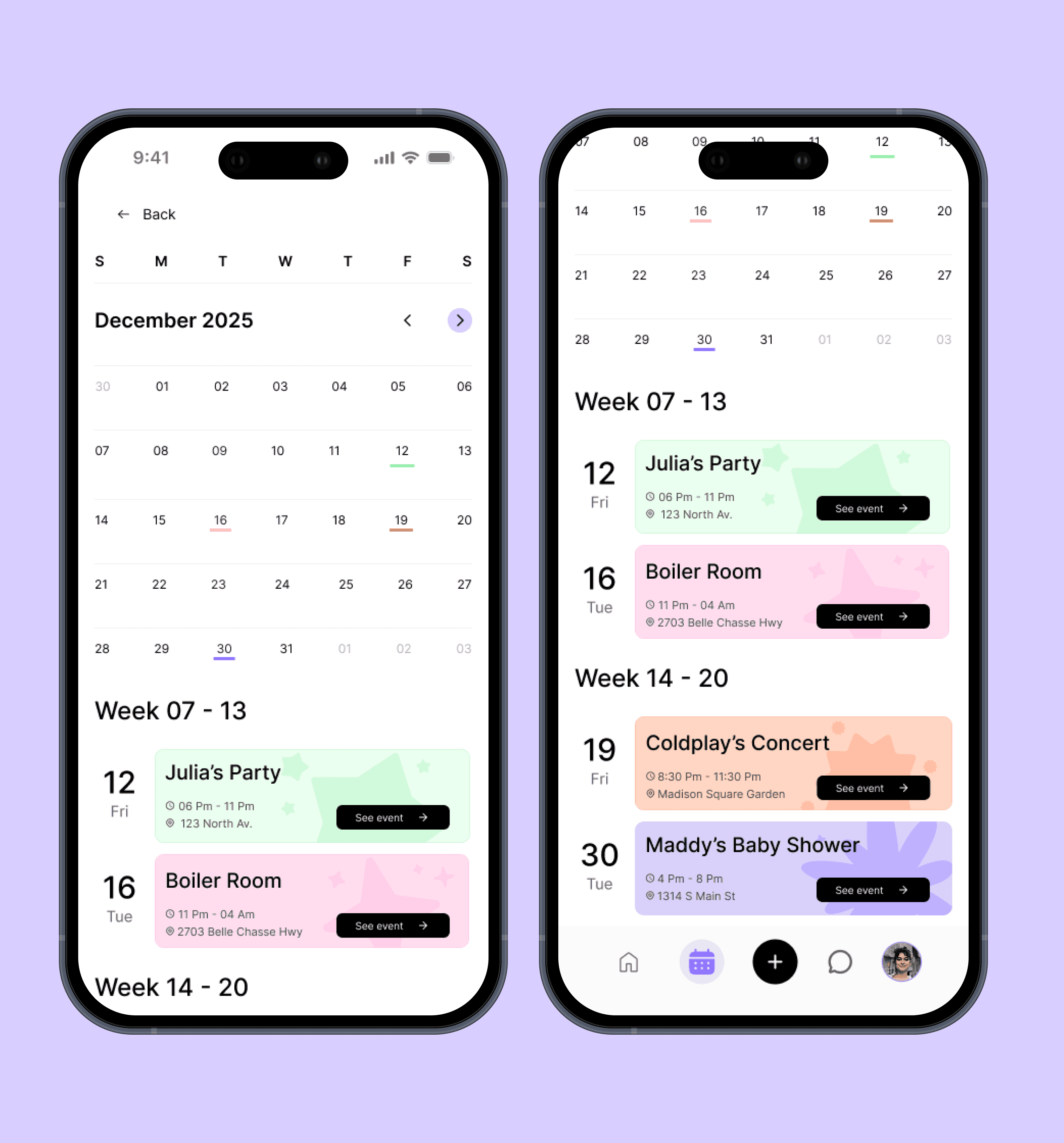
The calendar brings together every event a user has confirmed, private or public, in a single monthly view, with each date visually marked to show when something's happening. Below the month grid, events are also broken down by week, giving users a quicker, more scannable list of what's coming up without needing to scan the whole month.
Each event card gives direct access to its full details through a "See event" shortcut, so users don't have to search for it elsewhere. This view is directly linked to the home screen's upcoming events component, keeping both parts of the app in sync: whatever gets confirmed shows up here automatically, and the reminder on the home screen ties back to the same source of truth.
The calendar brings together every event a user has confirmed, private or public, in a single monthly view, with each date visually marked to show when something's happening. Below the month grid, events are also broken down by week, giving users a quicker, more scannable list of what's coming up without needing to scan the whole month.
Each event card gives direct access to its full details through a "See event" shortcut, so users don't have to search for it elsewhere. This view is directly linked to the home screen's upcoming events component, keeping both parts of the app in sync: whatever gets confirmed shows up here automatically, and the reminder on the home screen ties back to the same source of truth.
Event creation
Event creation
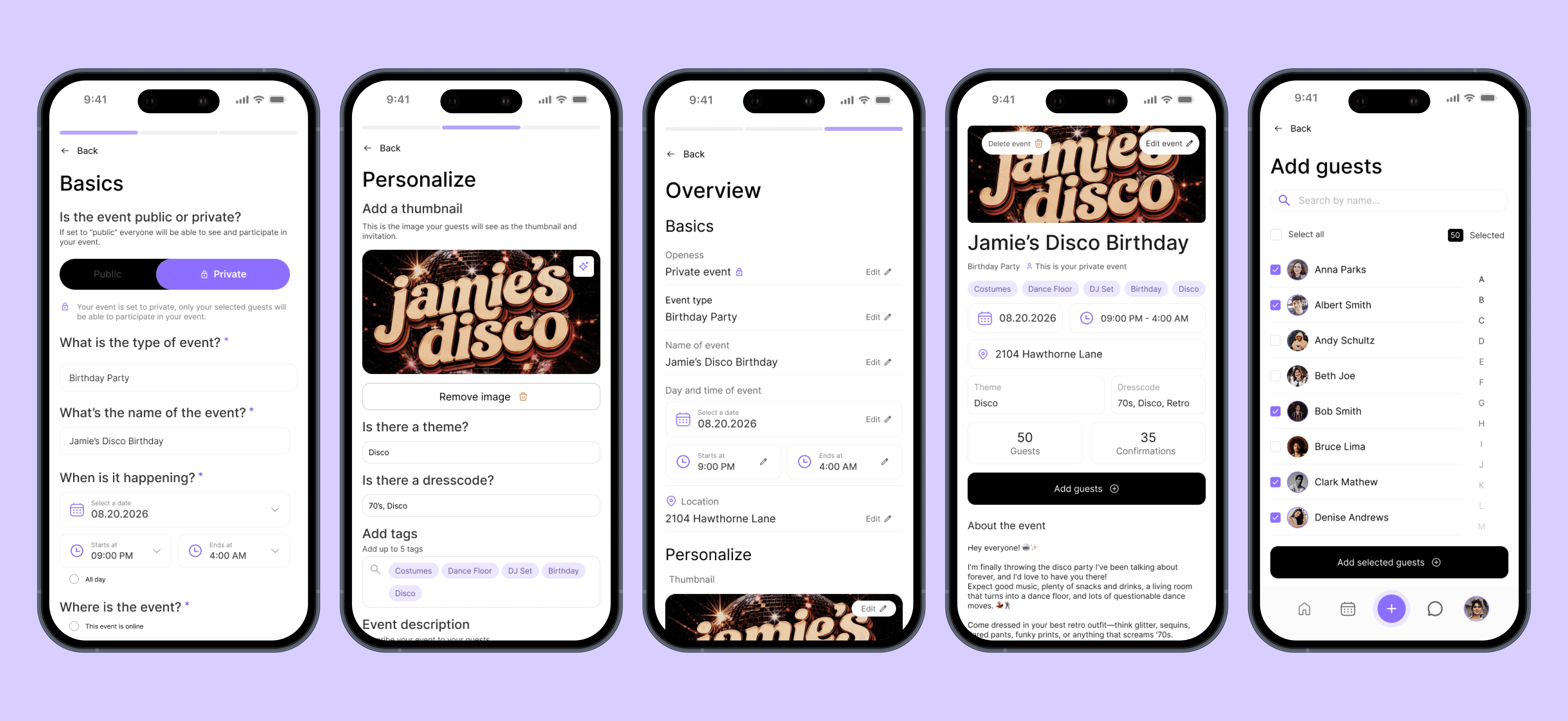
With the wireframe structure already defined, this flow now carries Plot's full visual identity: black for primary actions, and Inter keeping every input and label easy to read despite the playful thumbnails and tags.
The flow starts the same way, on Basics, where the event's core details are set. It's followed by Personalize, where hosts can add a thumbnail (uploaded or AI-generated), set a theme, dress code, tags, and description, giving the event its own visual identity before anyone sees it.
Adding guests also became a more robust, dedicated screen rather than a simple step in the creation flow. Hosts can search by name, select individually or all at once, and confirm the invite list in bulk. This made more sense as its own screen since managing guests, especially for larger private events, is something hosts often return to after the event already exists, not just once during setup.
With the wireframe structure already defined, this flow now carries Plot's full visual identity: black for primary actions, and Inter keeping every input and label easy to read despite the playful thumbnails and tags.
The flow starts the same way, on Basics, where the event's core details are set. It's followed by Personalize, where hosts can add a thumbnail (uploaded or AI-generated), set a theme, dress code, tags, and description, giving the event its own visual identity before anyone sees it.
Adding guests also became a more robust, dedicated screen rather than a simple step in the creation flow. Hosts can search by name, select individually or all at once, and confirm the invite list in bulk. This made more sense as its own screen since managing guests, especially for larger private events, is something hosts often return to after the event already exists, not just once during setup.
Event invitation
Event invitation
Following the same story-style structure defined in the wireframe, the invitation now carries Plot's full visual identity — the confetti-like decorative elements, gradient purple backgrounds, and playful iconography reinforce the celebratory, going-out spirit of the app from the very first screen.
The flow keeps its progression: who's hosting, the event's theme, who else has confirmed, then the key details of when and where. One detail worth highlighting is the theme screen: the image shown there is the same cover thumbnail the host chose during event creation, so guests see a consistent visual identity for the event across both experiences, from creation to invitation.
The flow still closes on the slide-to-RSVP interaction, with the same intentional friction as before, followed by a confirmation screen that lets guests know the event has been added to their calendar automatically.
Following the same story-style structure defined in the wireframe, the invitation now carries Plot's full visual identity — the confetti-like decorative elements, gradient purple backgrounds, and playful iconography reinforce the celebratory, going-out spirit of the app from the very first screen.
The flow keeps its progression: who's hosting, the event's theme, who else has confirmed, then the key details of when and where. One detail worth highlighting is the theme screen: the image shown there is the same cover thumbnail the host chose during event creation, so guests see a consistent visual identity for the event across both experiences, from creation to invitation.
The flow still closes on the slide-to-RSVP interaction, with the same intentional friction as before, followed by a confirmation screen that lets guests know the event has been added to their calendar automatically.

Check out a video simulation!
Check out a video simulation!
Made on After Effects
Chat
Chat
Chat brings the social side of Plot into direct conversation. Users can message friends privately, share event cards straight into a conversation, and organize group chats, all from one inbox split into All Chats, Groups, and Favorites.
Group chats have a specific role tied directly to events: whenever a private event is created, a group is automatically generated for it, giving the host a fast, centralized way to share updates with everyone involved. As guests confirm their attendance, they're automatically added to that group, so the conversation naturally grows alongside the guest list, without the host needing to add anyone manually. Notifications can also be muted per conversation, giving users control over which chats stay quiet in the background.
Chat brings the social side of Plot into direct conversation. Users can message friends privately, share event cards straight into a conversation, and organize group chats, all from one inbox split into All Chats, Groups, and Favorites.
Group chats have a specific role tied directly to events: whenever a private event is created, a group is automatically generated for it, giving the host a fast, centralized way to share updates with everyone involved. As guests confirm their attendance, they're automatically added to that group, so the conversation naturally grows alongside the guest list, without the host needing to add anyone manually. Notifications can also be muted per conversation, giving users control over which chats stay quiet in the background.

Profiles
Profiles
Plot shows three versions of a profile, depending on your relationship with that person.
On your own profile, you can edit your profile picture, cover image, and add tags describing the kinds of events you're into, shaping how friends discover shared interests with you.
A friend's profile shows all of that, plus their birthday and the events they're currently confirmed for. From here, you can invite them directly to an event or send a message, which opens straight into that chat.
For someone who isn't a friend yet, that same information stays locked. Confirmed events are hidden until the friend request is accepted, a deliberate privacy boundary that keeps a stranger from seeing where someone will be before there's an actual connection between them.
Plot shows three versions of a profile, depending on your relationship with that person.
On your own profile, you can edit your profile picture, cover image, and add tags describing the kinds of events you're into, shaping how friends discover shared interests with you.
A friend's profile shows all of that, plus their birthday and the events they're currently confirmed for. From here, you can invite them directly to an event or send a message, which opens straight into that chat.
For someone who isn't a friend yet, that same information stays locked. Confirmed events are hidden until the friend request is accepted, a deliberate privacy boundary that keeps a stranger from seeing where someone will be before there's an actual connection between them.

Navegate the prototype
Navegate the prototype
Learnings
Learnings
Designing for Bia and Rafael at the same time was one of the harder balancing acts in this project. One persona needed to discover more, the other needed to organize more. Instead of treating that as a conflict to resolve, it became a way to test whether the core features (feed, calendar, event creation) could genuinely serve both without turning into two separate products stitched together.
This project also reinforced how intentional friction can be a valid UX decision, not a mistake to design away. The slide-to-RSVP interaction goes against the instinct to make everything as fast as possible, but the goal here wasn't speed, it was intent: making sure a confirmation actually means something before it's made.
Finally, validating the idea through desk research and user interviews before sketching a single wireframe made the rest of the process faster and more confident. Instead of guessing what users might want, the wireframes and design decisions were already anchored in patterns that came directly from real conversations, not assumptions.
Designing for Bia and Rafael at the same time was one of the harder balancing acts in this project. One persona needed to discover more, the other needed to organize more. Instead of treating that as a conflict to resolve, it became a way to test whether the core features (feed, calendar, event creation) could genuinely serve both without turning into two separate products stitched together.
This project also reinforced how intentional friction can be a valid UX decision, not a mistake to design away. The slide-to-RSVP interaction goes against the instinct to make everything as fast as possible, but the goal here wasn't speed, it was intent: making sure a confirmation actually means something before it's made.
Finally, validating the idea through desk research and user interviews before sketching a single wireframe made the rest of the process faster and more confident. Instead of guessing what users might want, the wireframes and design decisions were already anchored in patterns that came directly from real conversations, not assumptions.
Check out more of my works