Year: 2026
Client: Ev & Saraiva lawyers
Role: Designer, Art director
Additional credits: Vitor Berbigier
Graphic design
Branding
Redesign
Ev & Saraiva Advogados is a law firm that came to us for a complete rebrand. Their previous identity no longer reflected where the firm stood today, and as they moved toward serving a higher-income client base, they needed a visual identity that felt more modern and sophisticated, while also communicating the technological edge they'd built into how they operate.
This project was developed in partnership with a colleague. My contribution focused on part of the research, art direction, logo creation, and defining the typography and color palette used across the identity.
The firm's previous identity no longer represented the team they'd become. It lacked a sense of strength and authority, qualities they now needed to project as they took on more high-stakes, high-profile work.
There were also practical problems built into the old identity:


Legibility at small sizes: thin lines caused the logo to lose clarity when applied to smaller materials, business cards, favicons, anywhere the mark needed to shrink
Weak recognition next to competitors: placed alongside other firms, the mark struggled to stand out, blending in rather than commanding attention
A color that undercut authority: the blue used throughout the brand felt too calm, almost weak, lacking the presence the firm wanted to communicate in their field
A generic central symbol: the logo's classic law column was a visual shorthand used by countless other firms, offering no real differentiation
What they wanted instead was an identity that felt personal to them specifically, distinct from competitors, and, most importantly, memorable at a glance, something the previous brand had never quite achieved.
The new mark trades the previous light blue for a deep, dark navy, immediately giving the brand a more sophisticated, authoritative presence. A second color was also added to the palette: an orange used specifically to create contrast and draw attention to small details, never as a dominant background, so it reads as a deliberate accent rather than competing with the navy for attention.
Thin lines remain part of the brand's visual signature, but with a heavier stroke weight this time, specifically to solve the legibility problem the old identity had. Every version of the mark was tested to hold up clearly at smaller sizes, something the previous logo could never guarantee.

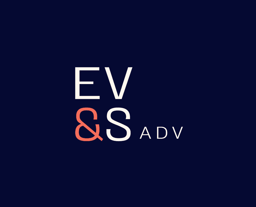

The system includes three versions: the primary logo with the full firm name spelled out, and two abbreviated versions built for materials where the full name isn't needed, each functioning as an easily recognizable symbol on its own.


For the white-background version, pure white should never be used, an off-white tone is the standard instead, paired with the dark navy defined earlier rather than pure black. This combination keeps the mark consistent with the brand's overall tone, even in its most neutral application.
This version is treated as secondary, reserved specifically for situations where the primary version wouldn't have enough contrast to work properly.
The client had one clear request: keep blue as the brand's core color. Our job was finding the right shade of it. To bring in the sophistication and strength they were looking for, we moved away from the original light blue and suggested a much darker tone instead, one that could carry authority on its own.
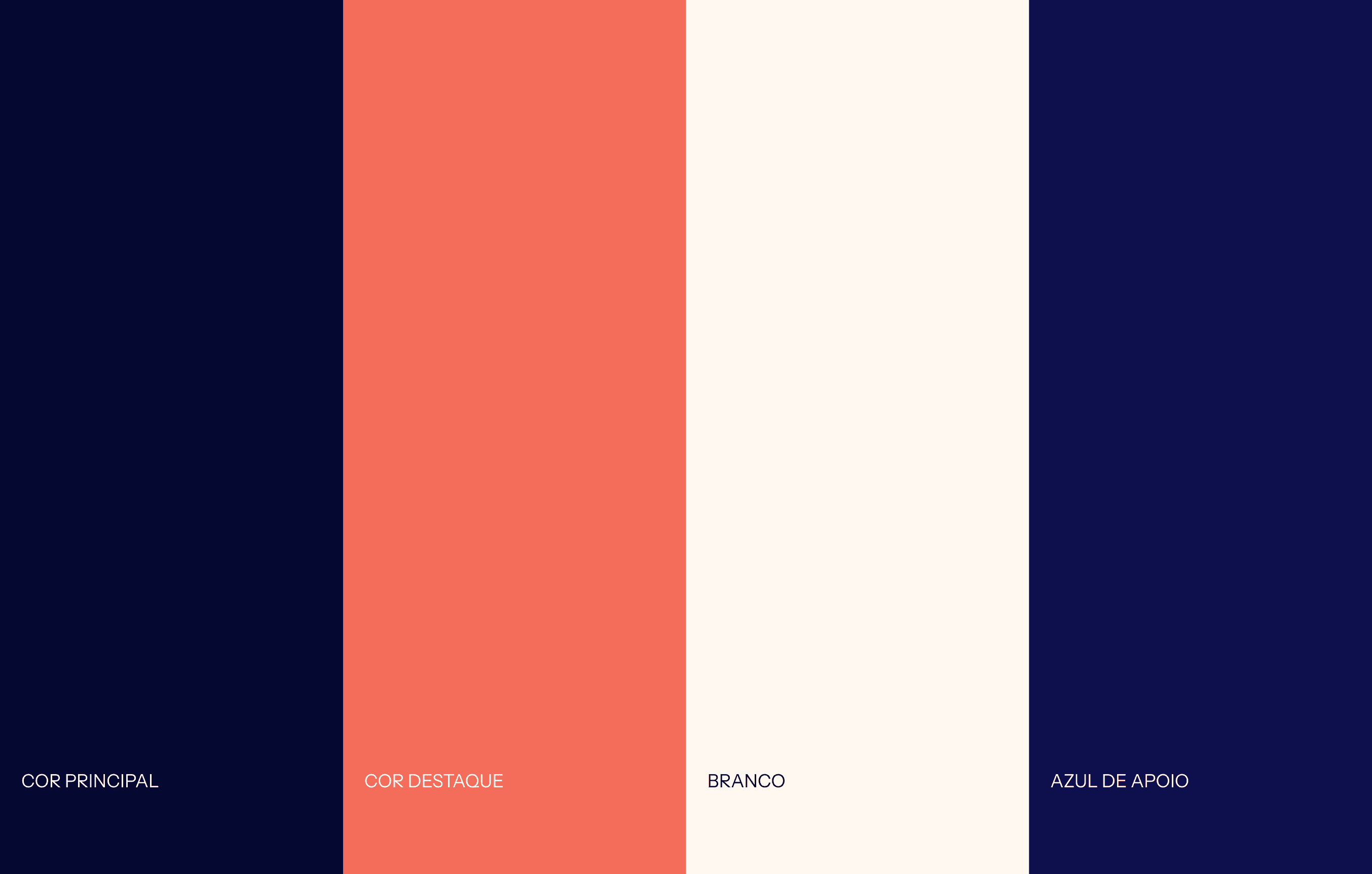
Two more colors were added to round out the palette. Orange was introduced purely for contrast, reserved for specific details rather than broad use. A supporting lighter blue was also added, meant for watermarks and layout composition when the design calls for it.
White, wherever used, is always the off-white version defined for the brand, never pure white. We also made a deliberate choice not to include black in the palette at all, using the primary dark navy in its place. Solid black tends to add a heaviness that didn't fit the brand's tone, and navy against white already provides the contrast black would otherwise offer, while keeping a level of sophistication that pure black couldn't achieve in the same way.
Beyond the logo and color palette, the brand needed a way to communicate four core pillars: multidisciplinarity, growth, collaboration, and technology. Rather than stating these values directly, we translated each one into its own graphic element, abstract shapes that can be used to compose layouts across both internal and external materials.

These graphics were designed for flexibility, working as layout support wherever the brand needs a bit more visual texture. That said, internal materials call for more intention behind their use: each graphic should be applied with its specific pillar in mind, so the visual choice still carries meaning rather than functioning as pure decoration.
One additional element created for the brand is a gradient, reserved exclusively for digital materials. Print reproduction can't always guarantee it translates well, so keeping it digital-only avoids any risk of inconsistency across physical materials. It also reinforces the technology pillar in a more literal way, technology is inherently digital, so keeping the gradient there as well keeps that association intentional rather than diluted across every touchpoint.

Materials


Check out more of my works